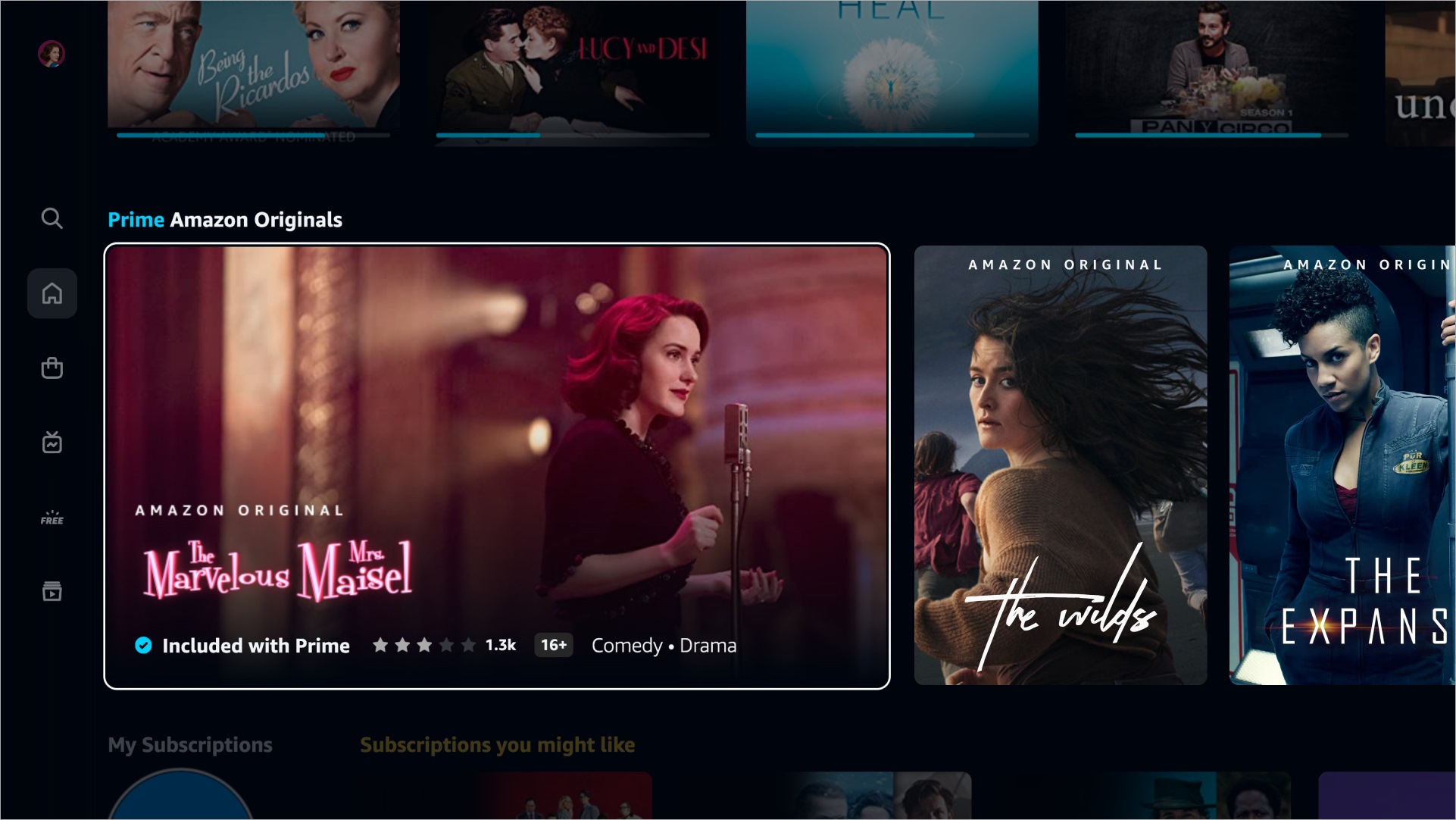
The first element that Amazon highlights from the redesign of the Prime Video app is the navigation menu, which has now been transformed into a vertical column with icons located on the left side of the screen. The six main areas are: Search, Home, Store, Live, Free with Ads, and My Space. The Home section has four subsections: All, Movies, Series, and Sports. This last tab makes little sense in some territories (such as Spain) and its visibility may depend on the region.
Prime Video experience may be different depending on territory and device.
Continuing in the Home area, we have the Prime Channels or subscriptions to other services (such as Starz), a quick access to continue watching content started, the Amazon Originals and a list with the ten most popular content. In addition, there are series and movies that stand out more thanks to the “Super Carousel”. On the other hand, the contents included in Prime Video are now better identified, which are marked with a blue icon. All other content available to buy, rent or subscribe to has a gold Euro (€) icon.
On the other hand, the search function has been redesigned to be able to find a specific title or explore different genres and collections. Search suggestions are displayed live as you type, and you can refine results by different criteria, including genre, video quality, or content type. The results are also flagged to clearly identify whether or not the content is included in Prime Video.
Prime Video’s new design comes at a really important time for the streaming service. streaming, which on September 2 will premiere the first season of The Lord of the Rings: the Rings of Power, one of the most expensive series in history. By then the user experience cannot fail.


Add Comment